

Crewe Care Community is part of the wider NHS Cheshire and Merseyside initiative to bring local services together and support people’s physical, mental, and social wellbeing at a local level.
The Crewe team approached TRCREATIVE to help them rebrand with a more positive, approachable identity that would better connect with the local community. Their previous look and feel didn’t reflect the friendly, collaborative nature of the services or the diverse people they serve.
The project needed to elevate the brand without feeling overly corporate, making it welcoming, accessible, and easy to use across a range of applications.
Health and care services can often feel clinical or distant, especially for people who need extra support. Crewe Care Community wanted to feel the opposite, open, people-led, and rooted in the local area.
The challenge was to create a brand that:
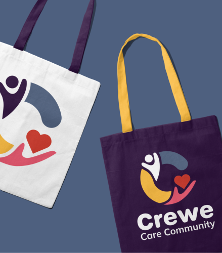
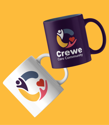
Brand identity
We created a fresh visual identity for Crewe Care Community, balancing professionalism with personality. The identity features:
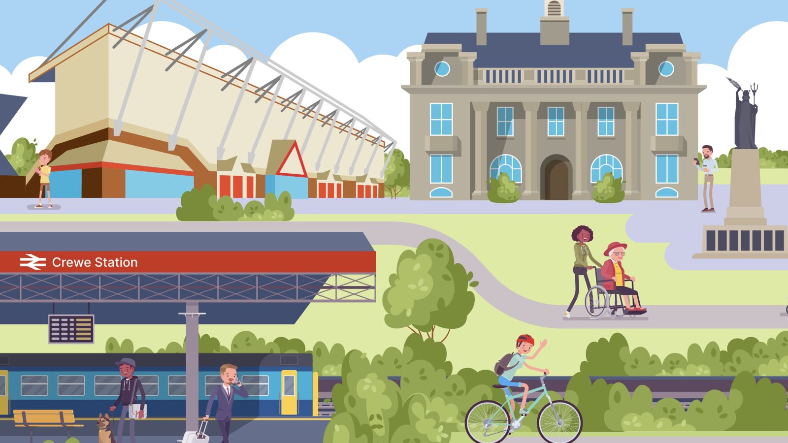
Bespoke illustration style
To bring the brand to life visually, we designed a series of bespoke illustrations representing people, places, and community themes, carefully crafted to reflect real diversity, care, and collaboration. These illustrations were designed to:
Brand toolkit
We provided a mini brand toolkit and assets to guide the use of the identity’s rollout across teams and partners.
"We have recently used Lynsey service to rebrand our care community logo and website. Lynsey did a fantastic job and exceeded expectations. We were very impressed with the communication and results and would highly recommend."
Rachel Grace
Crewe Care Community