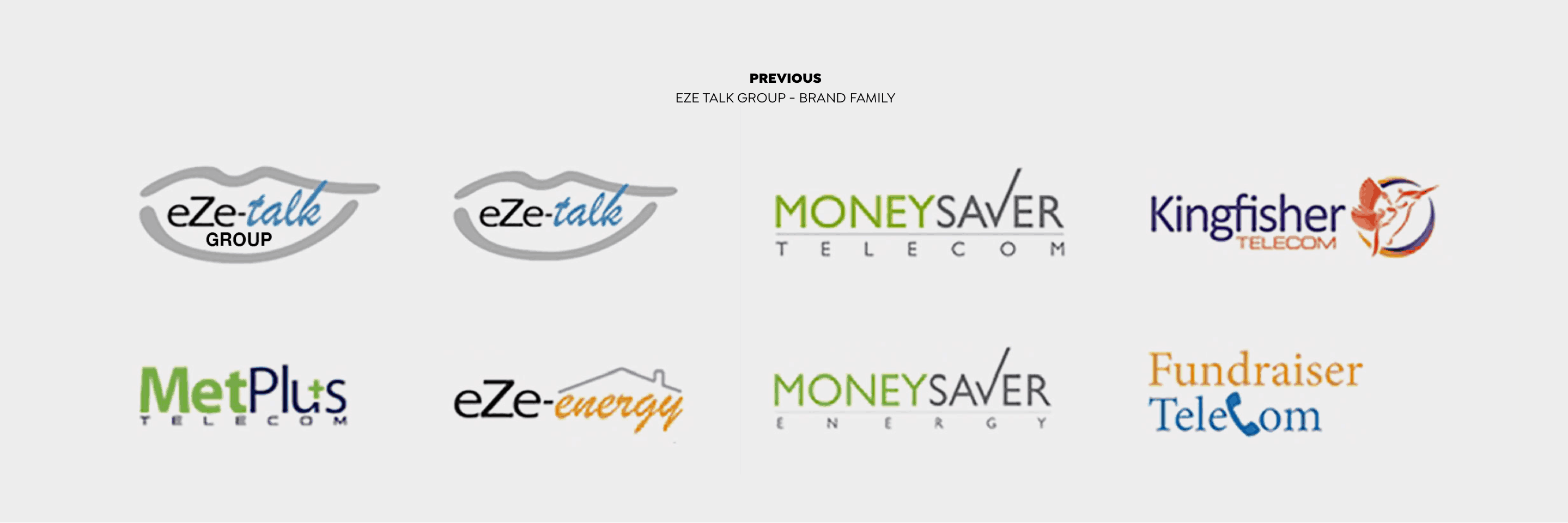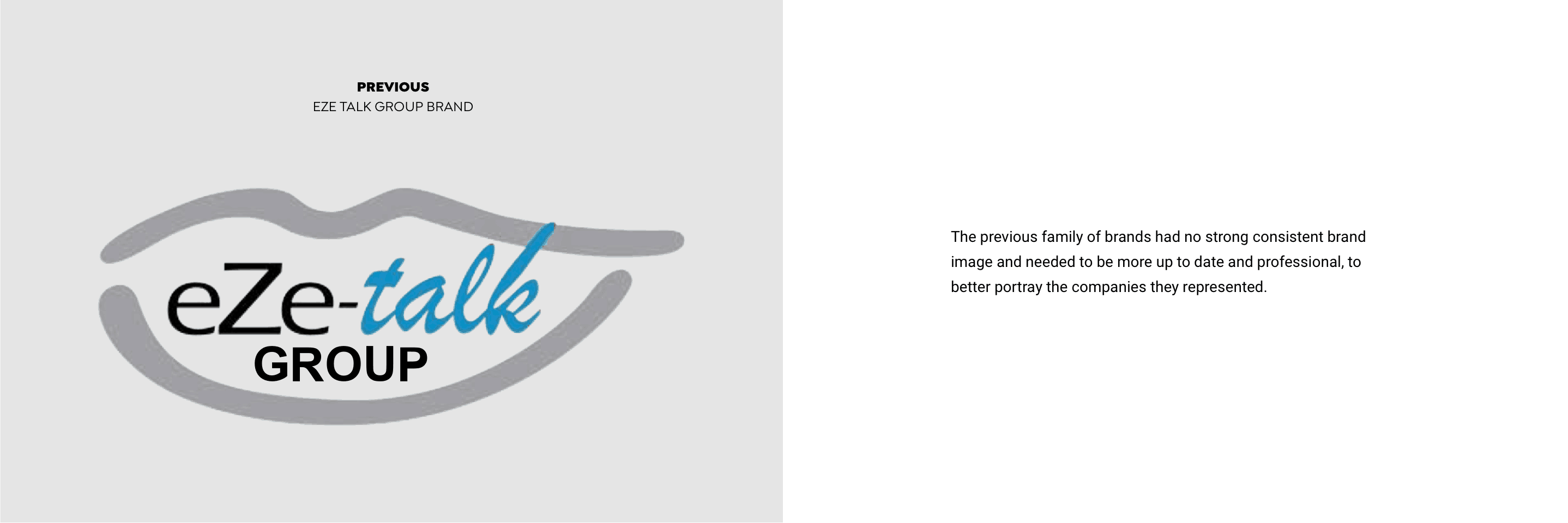
Eze Talk Group is a holding company of a growing number of telecommunications and energy sub-brands. The parent company, Eze Talk, was founded 20 years ago.
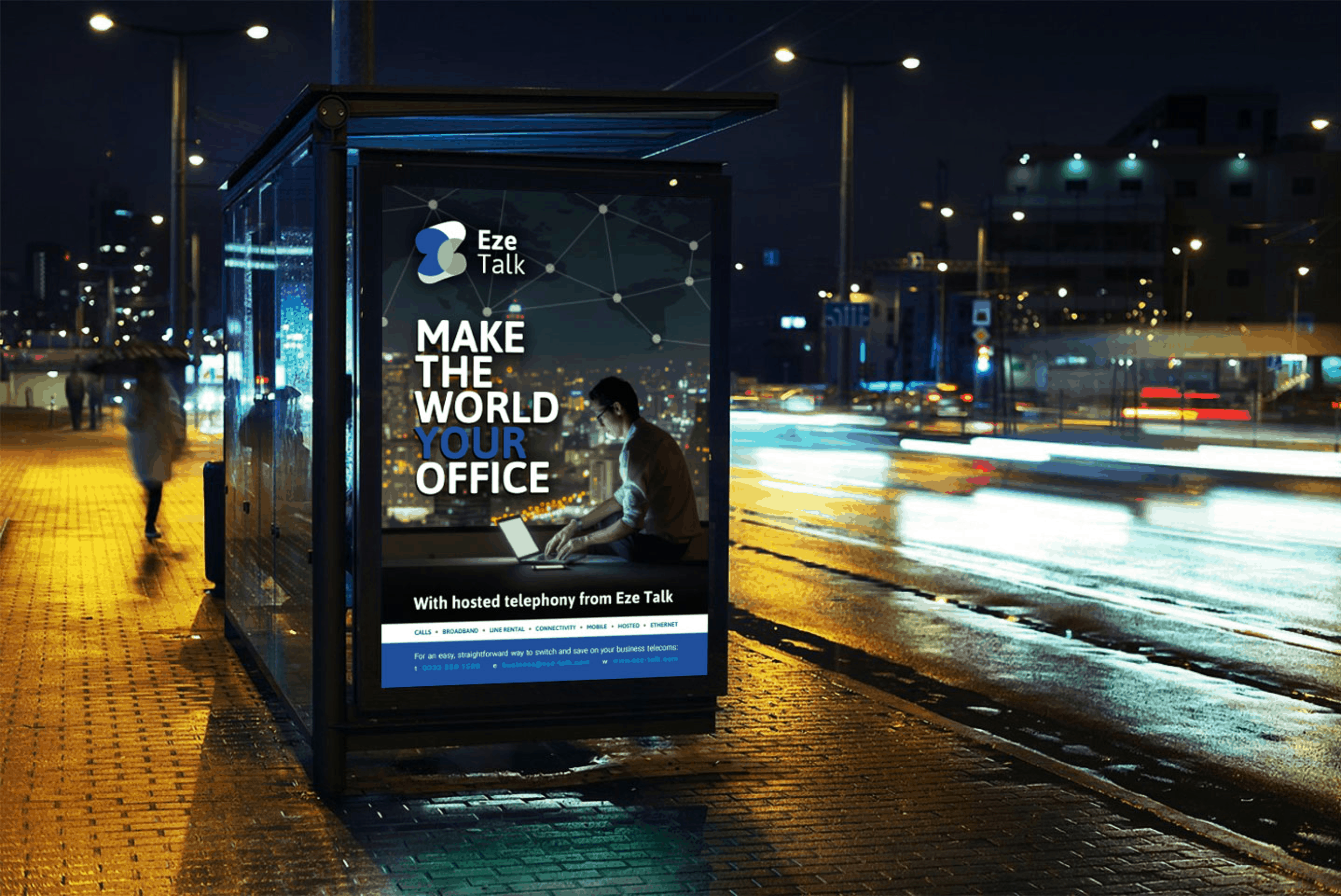
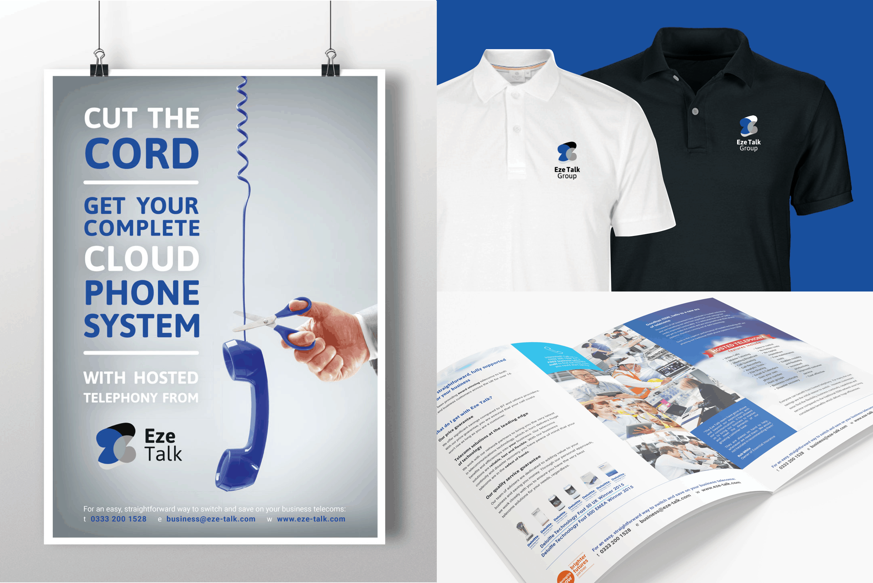
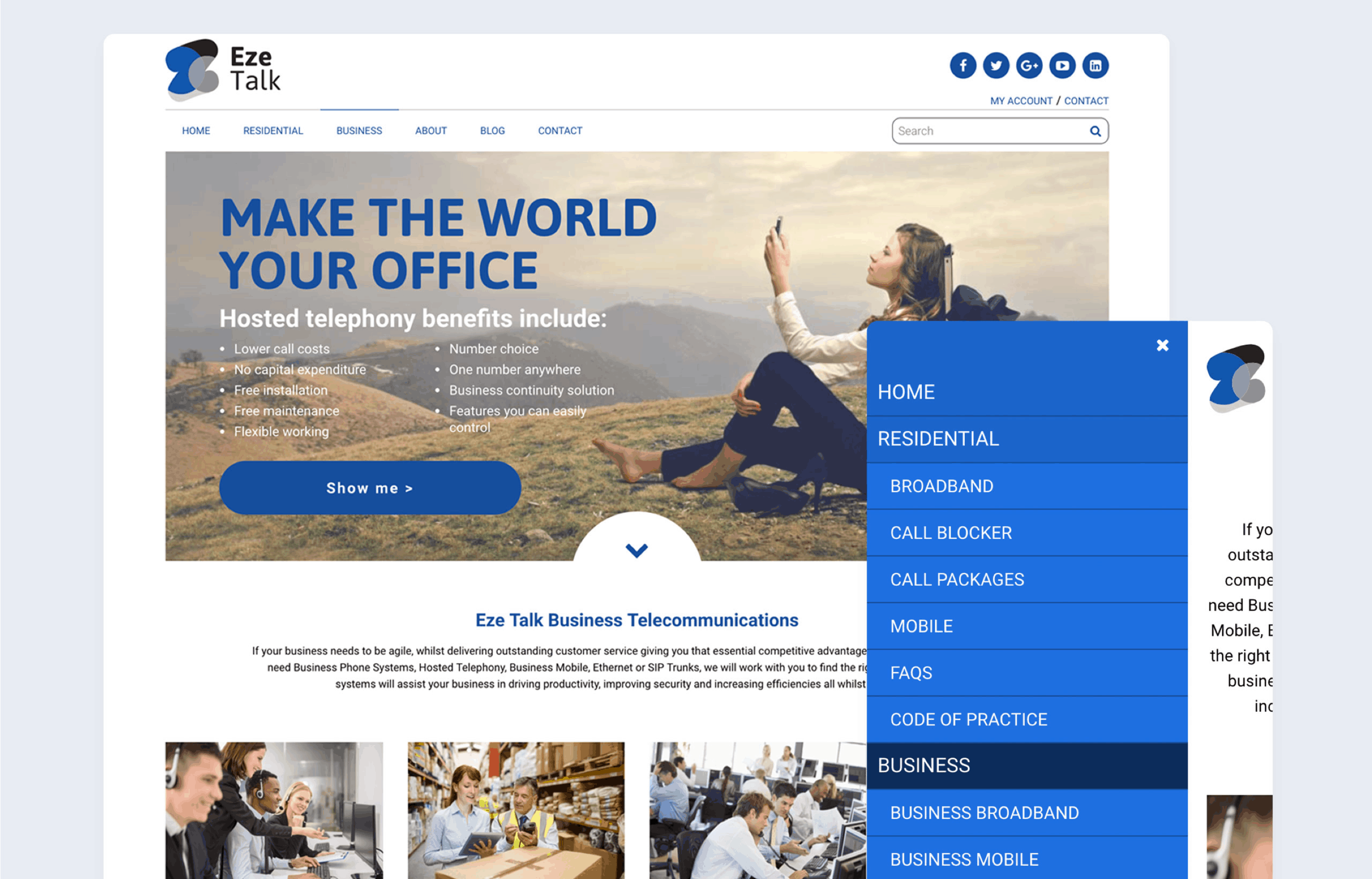
Eze Talk Group approached us to modernise and bring a consistent brand image to their ever-increasing corporate brand family by rebranding the whole group of eight companies.
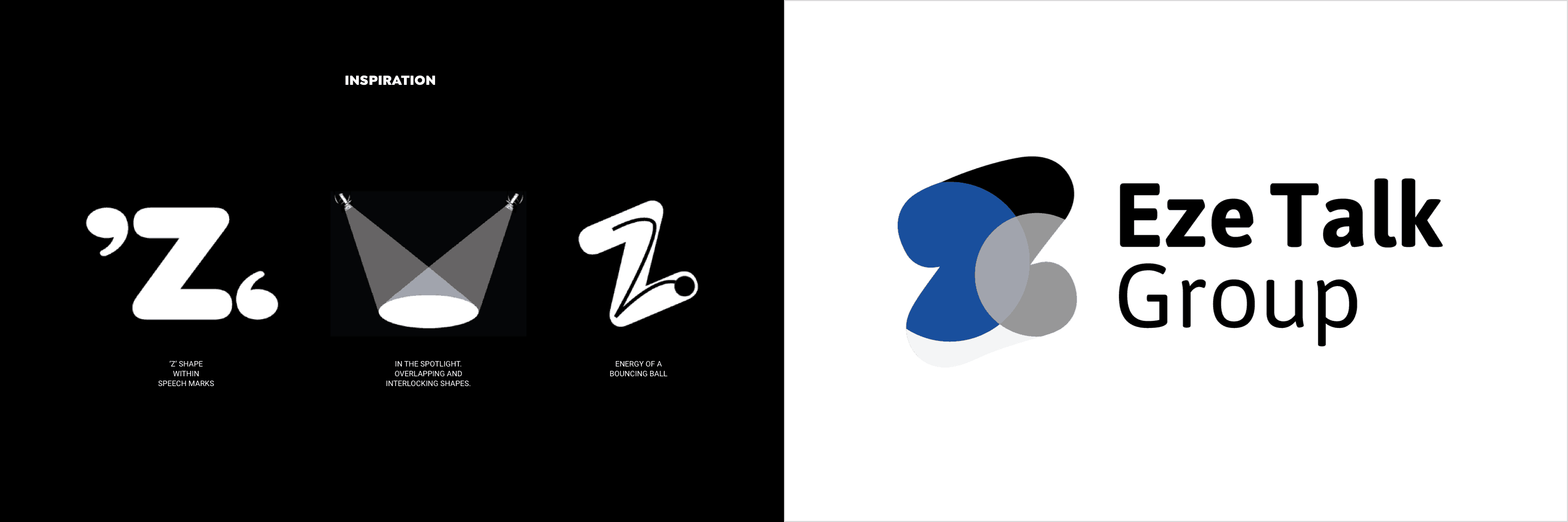
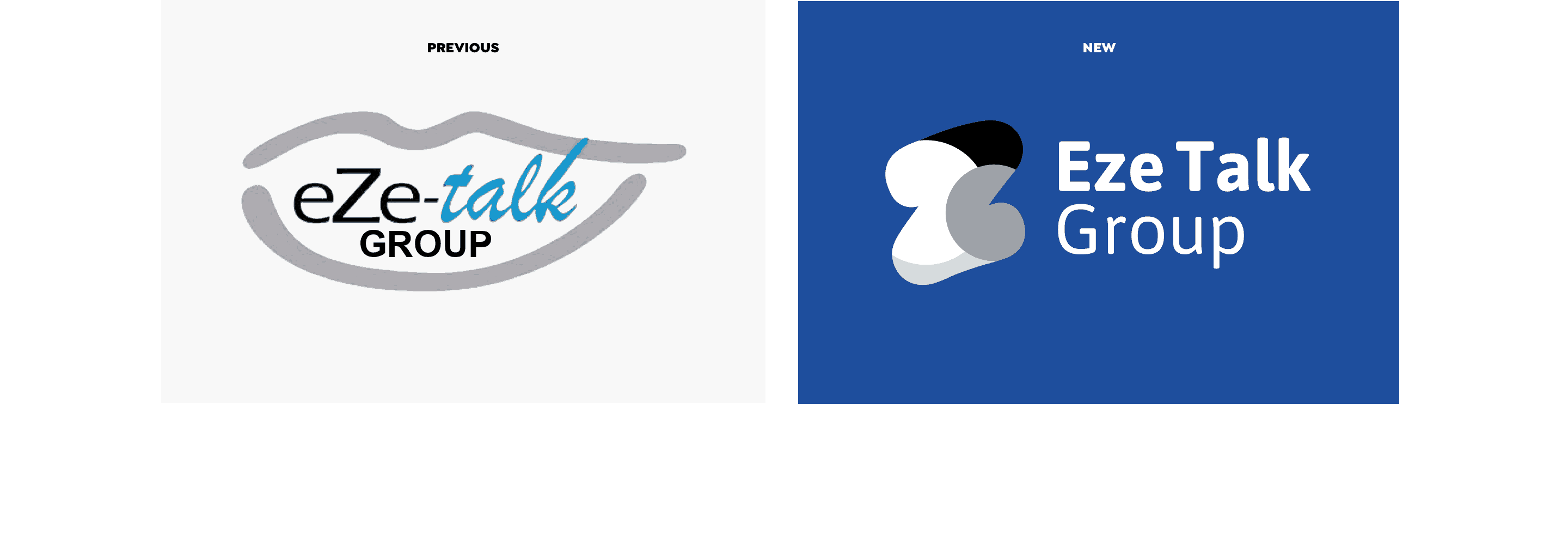
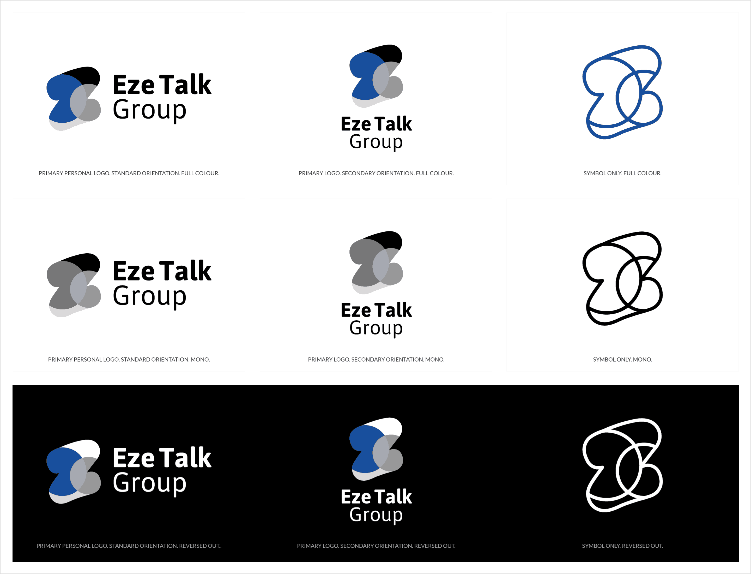
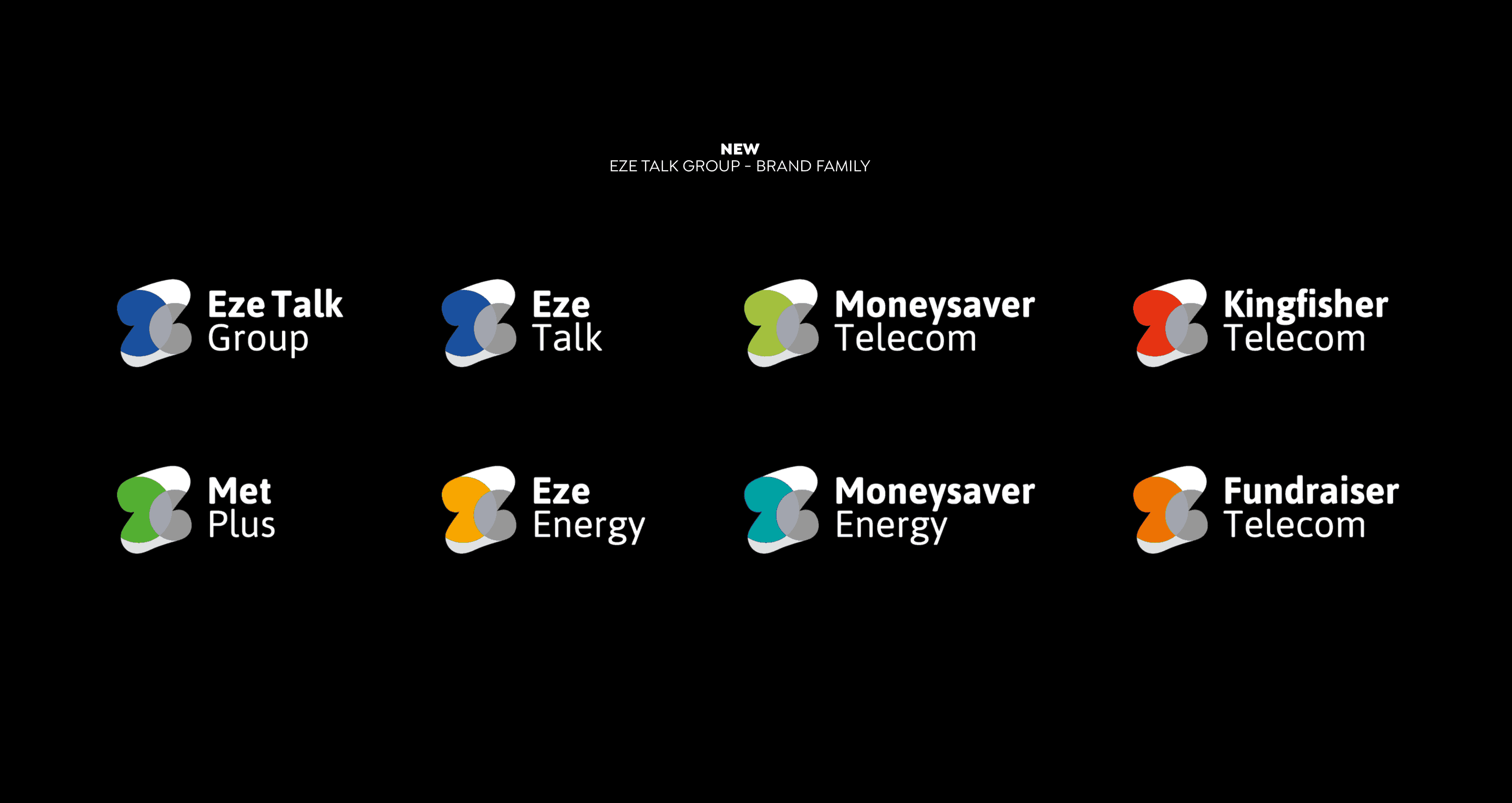
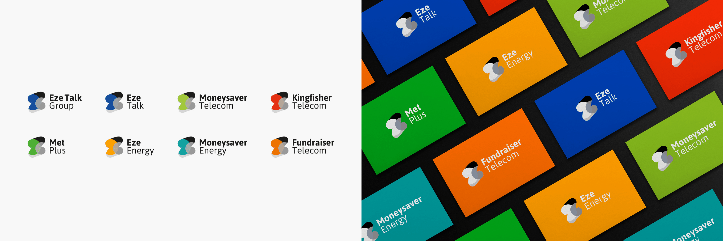
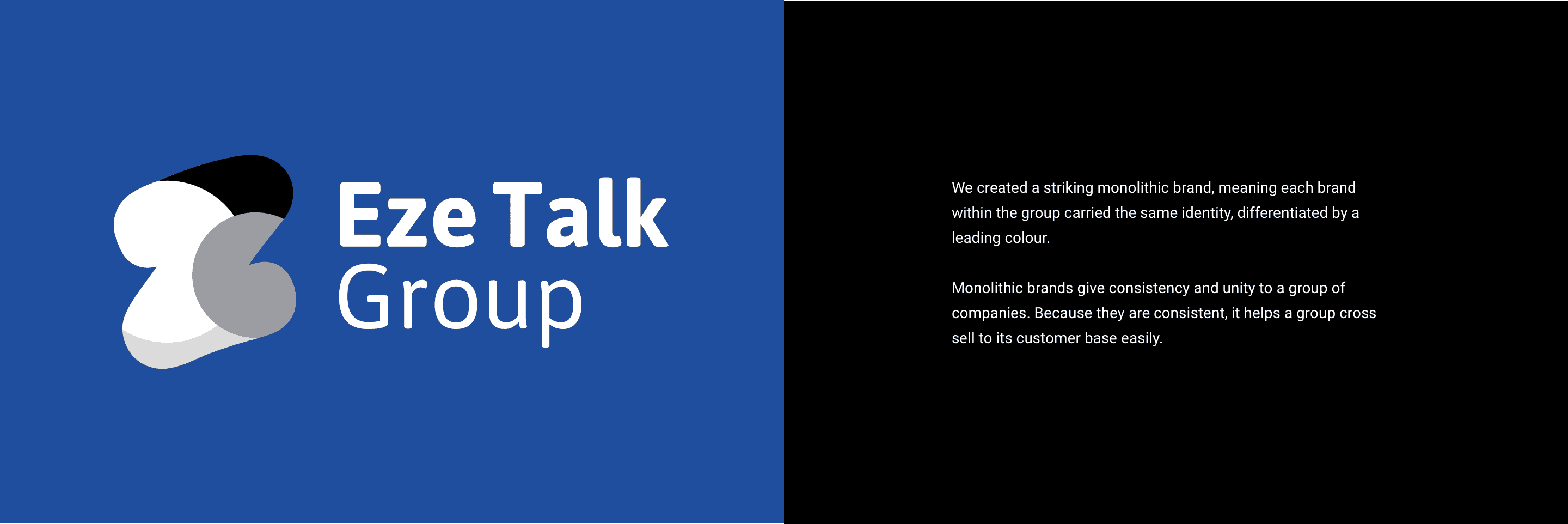
We understood that the ‘Z’ from their parent logo, Eze Talk, was how this, their main parent company, was best known. So we utilised it and progressed it through creative design. We took the generic communication symbols for speech marks and the energy shape of a bouncing ball and capsulise them within the shape of the letter ‘Z’, to create a monolithic brand identity that could be rolled out across the whole family of brands.
The overlapping and interlocking shapes give the impression of each brand being in the spotlight and coming together to form a whole.
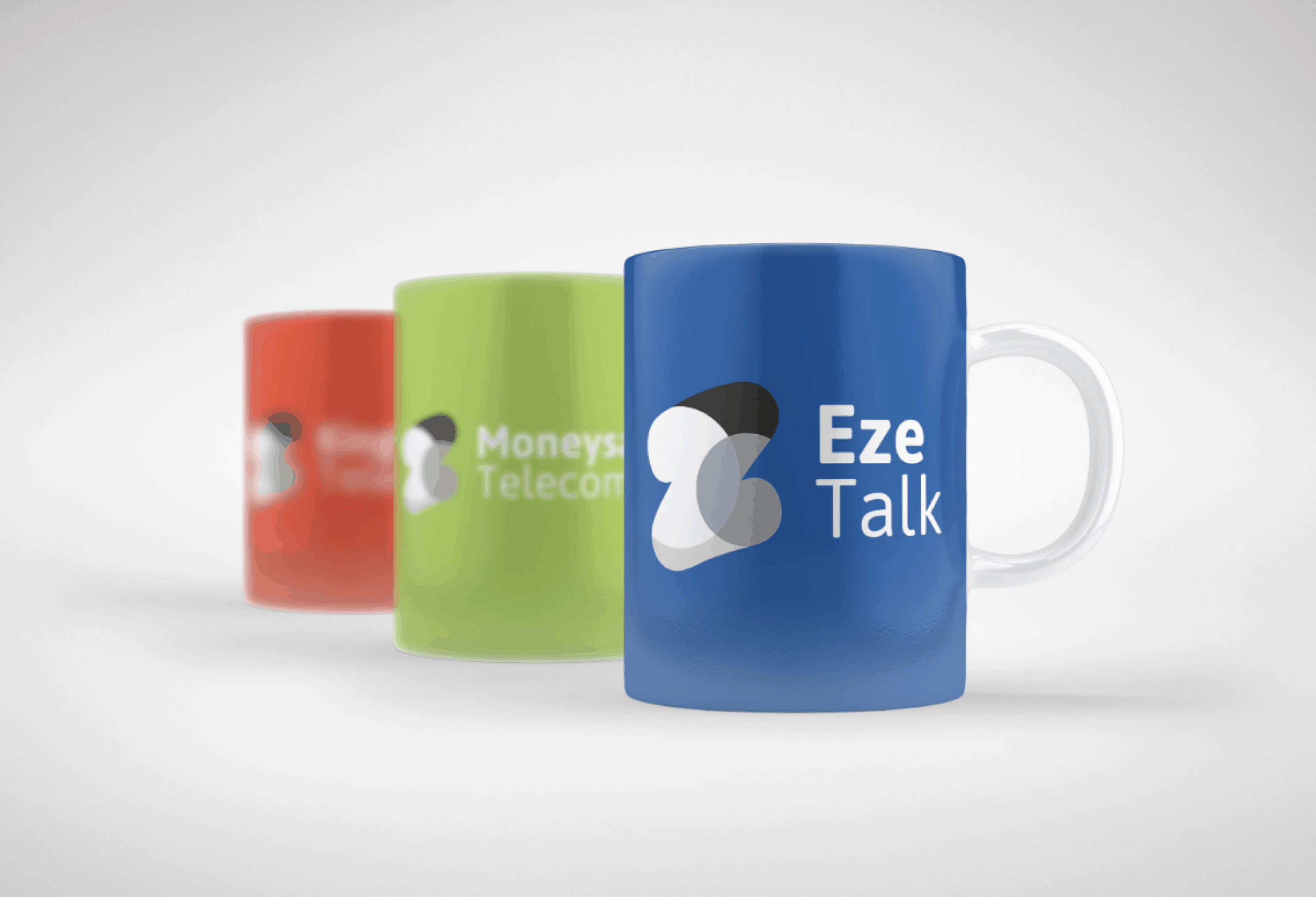
To give each new brand differentiation, we applied their previous primary brand colours to the new logo marques. This was done to give some correlation to their previous brand image to help encourage the buy-in from existing customers and staff.