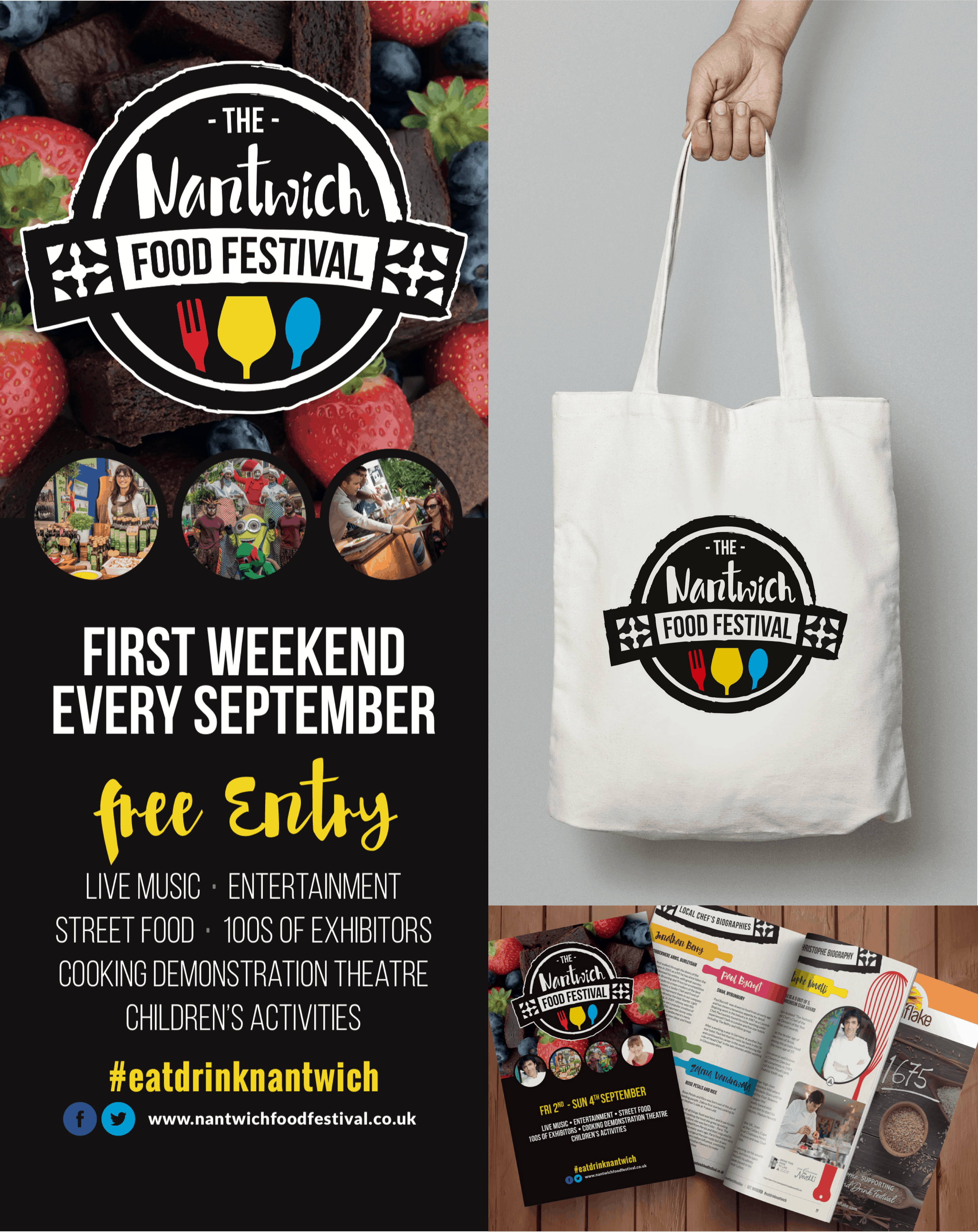
Nantwich Food Festival is a not-for-profit organisation, run completely by volunteers. It’s a fantastic asset to the small floral town of Nantwich and draws in thousands of visitors from near and far, year-on-year, over a September weekend.
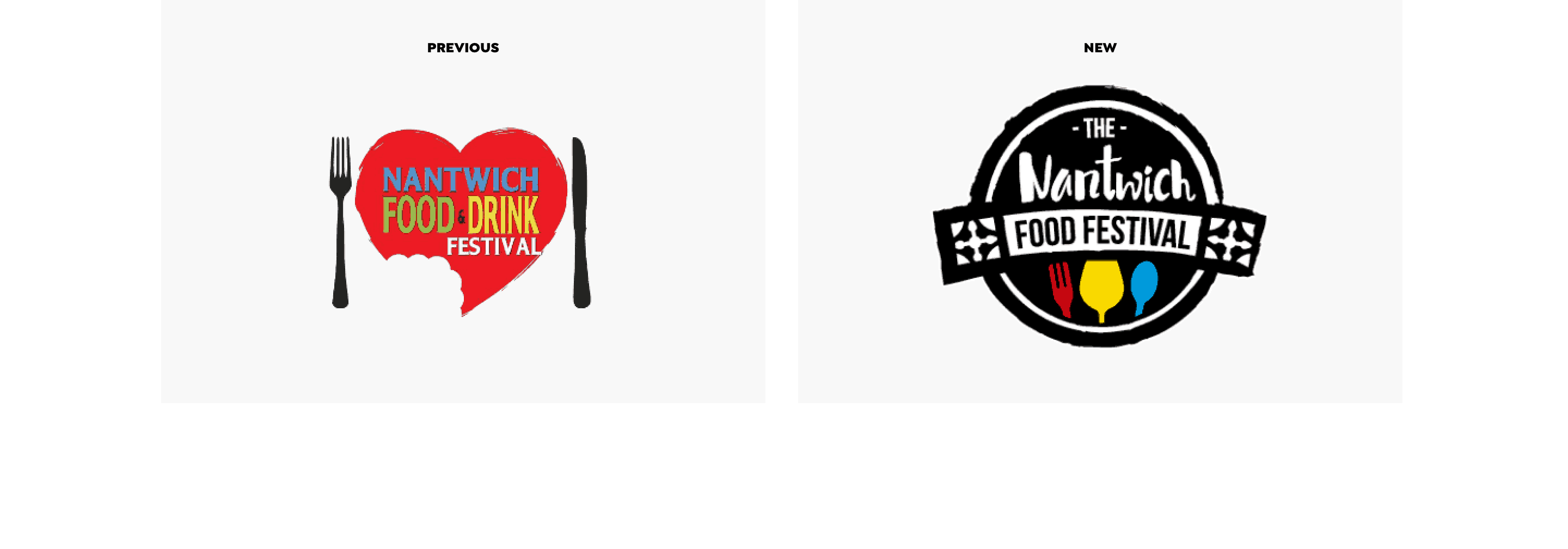
We were approached to support the festival by working with them on their rebrand. The Nantwich Food Festival was extremely proud of what their creative volunteers had achieved since beginning in 2010, but felt, as the Festival continues to grow, the time was right to present a more professional and consistent brand image. As avid visitors to the festival and food lovers ourselves, TRCREATIVE jumped at the chance of getting our teeth into this exciting project and support this local festival.
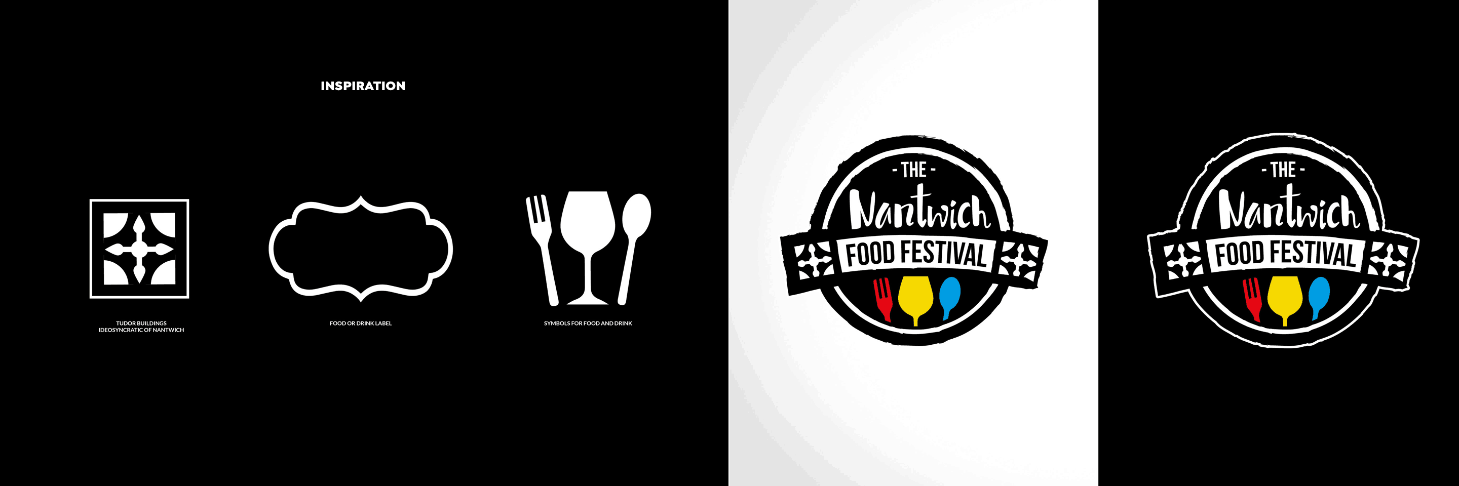
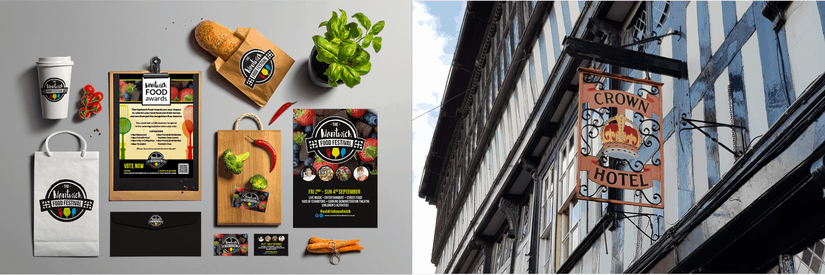
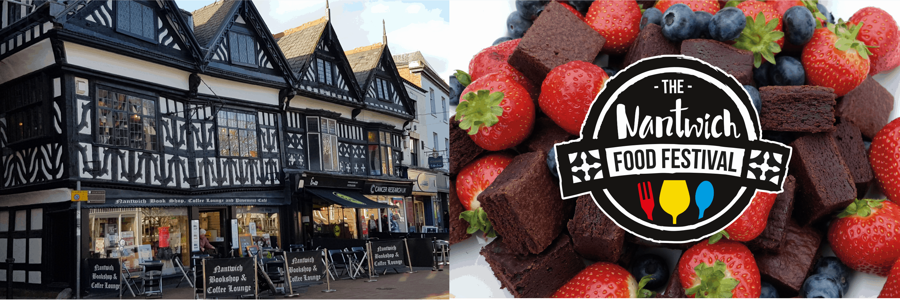
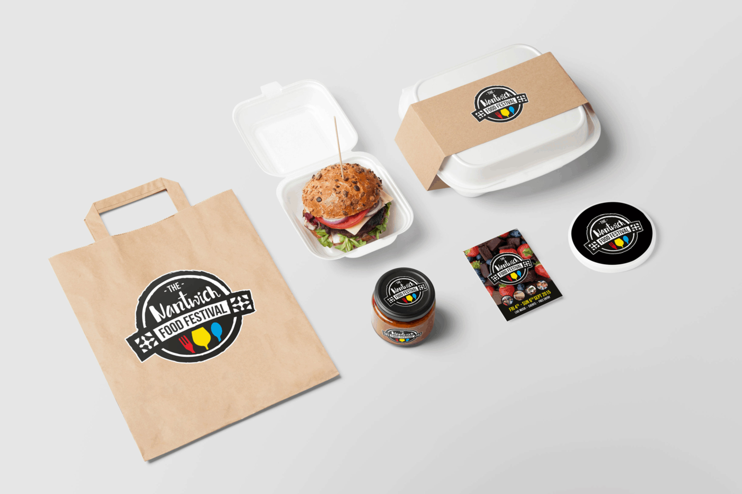
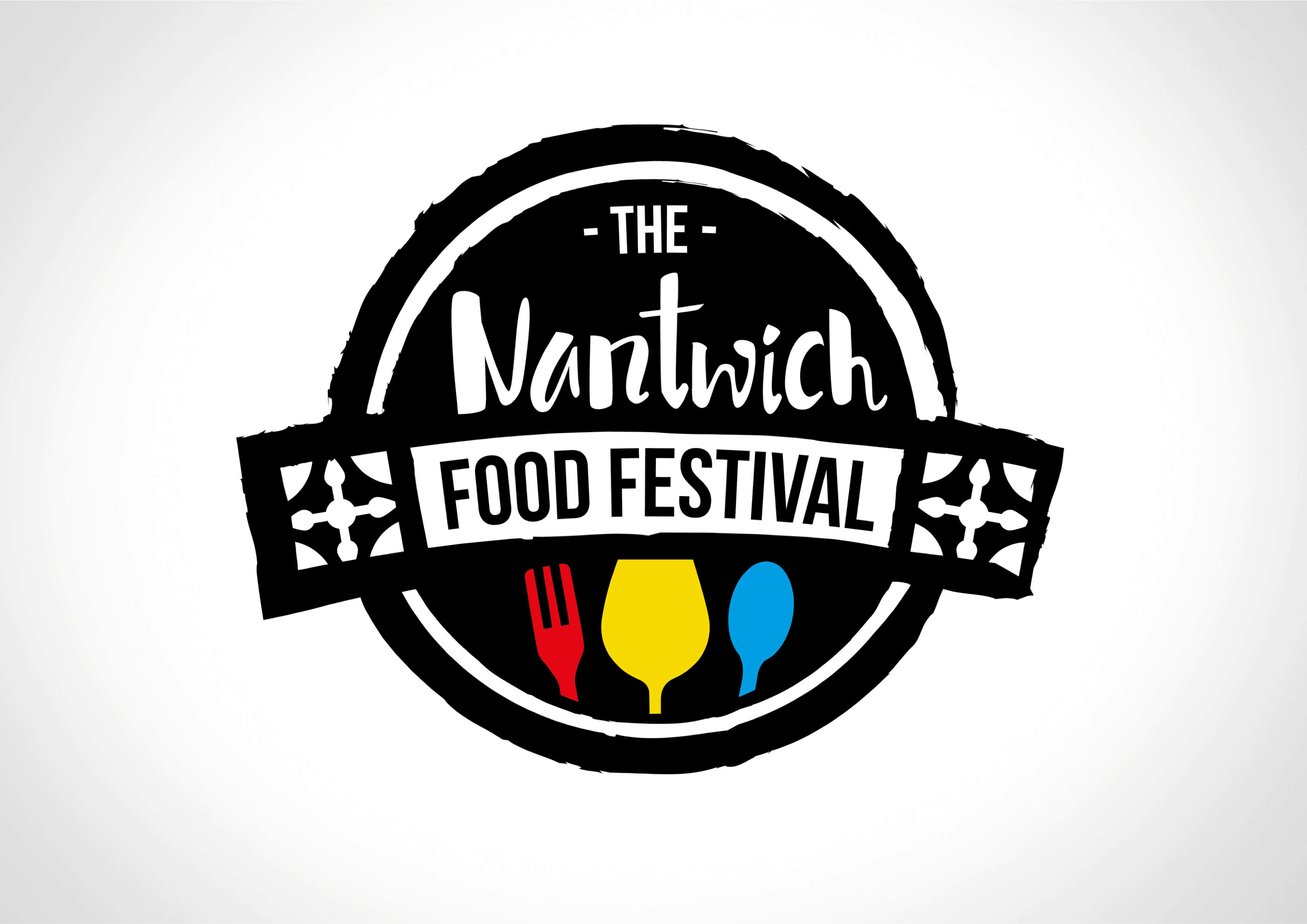
Nantwich is a medieval market town, famous for its black and white Tudor buildings. Using our creative design skills, we took elements from the Tudor style, combined them with synonymous symbols for food and drink, the fork, glass and spoon, and wrapped them in a food and drink style label. Now the brand identity can easily be added to various types of promotional material whilst maintaining a strong presence.
We chose to use the three primary colours, red, yellow and blue, to represent the food and drink utensils, as the key ingredients that open up the whole world of flavours, tastes and smells.