


TRCREATIVE is a rebranding agency in Cheshire helping organisations redefine their brand through strategy, creative design, marketing, web design and digital marketing.
We work with growing businesses ready to evolve, whether that means repositioning, refreshing their identity or aligning their brand with their future direction.
At TRCREATIVE, we help ambitious businesses evolve their brands to reflect where they are now, and where they’re going next.
Whether your business has grown, changed direction, or simply outgrown its current identity, we take a considered, strategic approach to rebranding, helping you realign your brand, sharpen your position and move forward with confidence.
Rebranding is a powerful opportunity to reset, refocus and unlock new potential.
Often, it’s driven by change. Your business may have evolved, new services, new leadership, new markets or a shift in ambition. What once worked no longer reflects who you are or where you’re heading.
You might be experiencing:
Whatever the trigger, rebranding is about more than how you look; it’s about how you’re understood.
We work closely with you to step back, challenge assumptions and redefine your brand from the inside out. From positioning and messaging to visual identity, we create brands that feel sharper, more relevant and built for what comes next.
As a full-service agency, we don’t stop at strategy and identity.
Once your brand is defined, we bring it to life across everything you do, from website design and development to marketing campaigns, collateral and digital content.
This ensures your rebrand is not only well thought through, but fully realised, consistent, impactful and ready to support your next stage of growth.
A well-timed rebrand can transform how your business is seen, creating clarity internally and confidence externally.
When everything aligns, your brand becomes a powerful tool for growth.
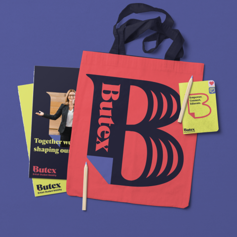
Reconnecting a global education network with a bold new brand and digital presence.
Butex, the British Universities Transnational Exchange Association, is the UK’s leading network for study abroad and exchange. With a growing membership of universities, students, and international partners, Butex needed a refreshed brand and website to reflect its role as a dynamic connector in global higher education.
Rebranding is more than updating a logo. It’s about redefining how your organisation is understood, experienced and remembered.
At TRCREATIVE, we guide organisations through a structured rebranding process that combines brand strategy, creative design and practical implementation. Our approach ensures your new brand reflects who you are today and where you want to go next.
Every successful rebrand begins with understanding. We take time to explore your organisation, your audience and the challenges your brand needs to solve.
This stage often includes stakeholder conversations, brand audits and market research. The goal is to uncover the strengths of your existing brand and identify opportunities for improvement.
Once we understand the landscape, we develop a clear brand strategy that defines how your organisation should be positioned.
This stage clarifies your brand purpose, values, audience and messaging. It ensures that the rebrand is grounded in strategy rather than simply a visual change.
With a strong strategy in place, our designers begin developing the creative direction for your new brand identity.
This may include logo design, colour palettes, typography, imagery and visual language. The aim is to create a distinctive and memorable brand identity that communicates your story clearly and consistently.
The final stage is introducing your new brand to the world. We support organisations with brand launch planning, website updates, marketing campaigns and internal communications.
By carefully managing the rollout, we help ensure your new identity is introduced clearly and confidently across every touchpoint.
The result is a brand that reflects your organisation today and supports your future growth.
If your strategic plans and goals have changed since you first began trading or launched your product, maybe it’s time to rethink your branding? Failure to change when the time is right could lead you to fall behind your competitors and ultimately lose you custom.
Your brand is your calling card to the world, and if it’s no longer representational of your values, services or product, it might be time for a change. Whether you established your company 5 years ago or 50 years ago, perhaps what you thought your company would become didn’t come to fruition – and instead, you evolved into something else. There is no need to stick with your original branding if it’s not getting across the message you want it to.
Looking to expand into other markets or target other demographics? It might be time to call in the rebranding team. What served you well in the past could well hold you back when it comes to sourcing new customers in the present, so if your current brand feels like a weight around your neck rather than an asset, consider investing in a new image.
When first setting up a business or launching a product, it’s entirely possible you had neither the time, knowledge or resources to create quite the sort of brand you would have liked. If you find yourself feeling embarrassment rather than pride every time you hand over your business card, don’t be afraid to rebrand.
Top companies want to attract the best talent, and if your current branding is proving off-putting to the best potential new staff, then considering changing it is an entirely valid and proactive choice. Without great team members, it will be hard to see real growth in the future – you need talented people with big ideas who are capable of getting things done. If employees with these qualities are running for the hills, it’s probably time for a change.
Rebranding isn’t just about change, it’s about clarity, direction and creating a brand that truly reflects your ambition.
If you’re ready to move forward with confidence, we’d love to help shape what comes next.
Start the conversation, and let’s build your next chapter together.